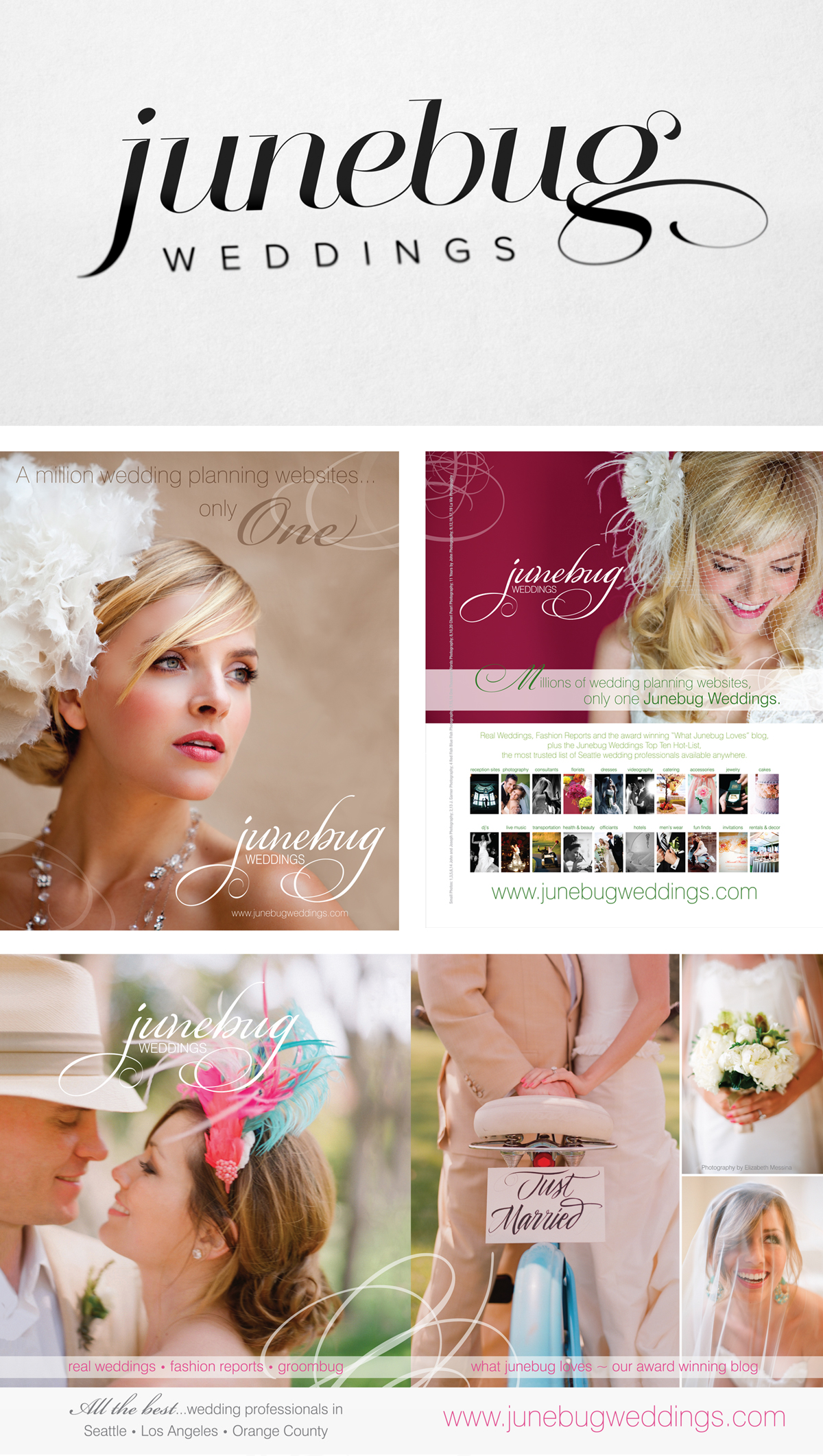
I was scared and beyond excited when the Junebug girls gave me a call and told me it was time for an update. It had been barely 7 years since they first called me up with their business plan and ideas. Since that day, the brand has grown leaps and bounds. The original logo had become the anchor to the brand and it fueled such strong branding guidelines that they took it and ran. We’ve been through several web site designs and today they are globally recognized and their brand is only growing stronger.
So, how do you make that better? How do you “update” a logo like that without upsetting or alienating such a massive audience that has grown with the brand? It was a fun and daring process but together we nailed it. The new logo has been unanimously accepted and commands it’s own new presence and modern persona. Above are some of my favorite magazine ads with the original logo. Stunning photography always helps.
